A home screen without a status bar is a photograph: wallpaper edge to edge, clock floating, nothing at the top reminding you about battery percentages and signal strength. It is also, in daily use, a small act of self-sabotage for many people — which is why this guide to the hide status bar android home screen idea in Smart Launcher 6 spends as much time on what you lose as on how to do it. By the end you will either run a genuinely considered full-screen setup, with replacements for everything the bar did, or choose the middle path that keeps the look and the information.
What hiding the status bar actually changes
The status bar is the most information-dense strip on your phone: time, battery, signal, Wi-Fi, notification icons, sometimes more. Hiding it on the home screen removes all of that at a stroke, which is precisely the appeal for users whose wallpaper and layout are a designed object. The launcher underneath does not change at all — same Flower, same pages, same drawer — only the frame disappears.
Nothing is deleted. On most devices a swipe down from the top edge still reveals the bar together with the notification shade, and the bar returns of its own accord inside apps, during calls and around system dialogs. Immersion on the home screen is a presentation choice for one surface, not a system-wide vow.
Treat these numbers as a starting point: apply them in Smart Launcher 6 under Settings → Home screen → Grid, use the layout for a day, then nudge one value at a time — your wallpaper, widget sizes and one-handed reach all shift what feels right.
Step one: find the setting and switch it safely
Look in Smart Launcher’s home screen settings for a full-screen, immersive or status bar visibility option, where your version offers it. Toggle it on, return to the home screen, and before admiring the result, check three reachability basics: you can still pull the shade down first try, your gesture navigation still works from the bottom edge, and any edge panels you use still trigger. Top-edge gestures and hidden bars occasionally quarrel on specific devices, and discovering that during a missed alarm is the wrong order.
If the option is absent on your build, that is a version or device limitation rather than a hidden menu you have failed to find. The alternatives later in this guide achieve most of the look without it.
The replacement clock deserves care, so see the clock widget customisation guide, and read how panels blend with a transparent top in the Ambient theme setup guide. Complete the immersive feel with changing scroll effects and page transitions and setting a different wallpaper for each page. More guides sit on the APKBZ home page.
Step two: replace everything the bar was doing
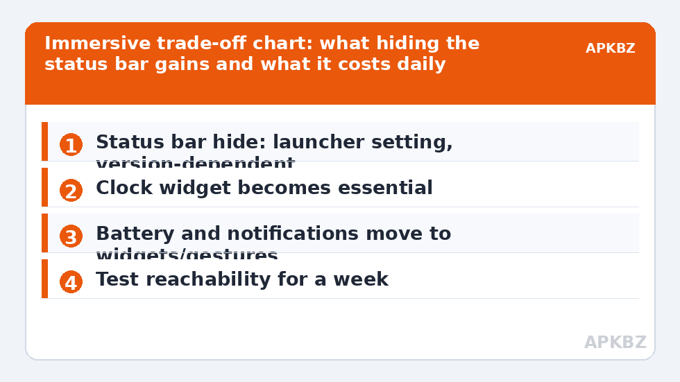
A hidden bar only works if its jobs are rehoused. The clock is easy: Smart Launcher’s own clock widget becomes your time source, placed where your eyes already go. Battery needs a conscious solution — a small battery widget, a widget stack member you check in the morning, or simply accepting the swipe-down check. Choose deliberately, because running a phone blind on battery creates more anxiety than the bar ever did.
- Notifications: rely on badges on the apps themselves plus the shade; if an app matters, its badge becomes its status icon.
- Signal and Wi-Fi: most people discover they checked these daily out of habit, not need.
- Alarms and timers: their icons vanish too, so a clock widget showing the next alarm is a wise addition.
Live with the replacements for a week before judging. The first two days feel exposed; by day five most users have either converted fully or know exactly which missing glance they cannot live without.
The middle paths most people should choose
Before going fully immersive, try the transparent or blended status bar look that theming already gives you. When the launcher theme tints the bar area to match the wallpaper — or your device renders the bar over the wallpaper rather than on a black strip — the visual interruption mostly disappears while the information survives. For many layouts this is the honest sweet spot: designed appearance, zero functional sacrifice.
A second middle path is page-selective thinking. Keep the bar on your working main page, and let a media or display page carry the full-screen ambition through its widgets and wallpaper instead. Immersion as a destination you swipe to is often more delightful than immersion as a permanent condition.
The middle paths most people should choose
| Status bar job | Replacement | Cost |
|---|---|---|
| Clock | Home screen clock widget | None, often better |
| Battery | Battery widget or swipe check | One extra glance step |
| Notifications | App badges plus shade | Less ambient awareness |
| Signal status | Shade when needed | Minimal for most users |
Who full-screen genuinely suits
Full-screen immersion earns its keep on dedicated devices and dedicated pages: a media page that behaves like a console, a tablet on a stand, a second phone used as a smart display, or a main screen whose owner honestly checks battery and notifications rarely. It suits designed layouts — the kind with a considered clock, a calm wallpaper and very little else — because there is nothing at the top competing with the composition.
Whichever you choose, the setting is reversible in seconds, which makes it a perfect experiment. Run immersive for one week, note every moment you swiped down just to check the time or battery, and let that tally — not a screenshot — make the final decision.
Full-screen etiquette: alarms, calls and other realities
A week of immersive use surfaces practical questions worth answering in advance. Alarms still sound and still take over the screen when they fire; immersion hides icons, not interruptions that matter. Incoming calls likewise appear normally, because the dialer is an app surface where the bar returns. Timers and stopwatches are the subtle case: they keep running perfectly, but their glanceable icon is gone, so cooks and trainers should keep a clock widget that surfaces countdowns, or accept the swipe-down check as part of the routine.
Screen recording and casting indicators also live in the status bar on many devices, and their absence cuts both ways: recordings begin less obtrusively, but you also lose the persistent reminder that a recording is running. If you record often — tutorials, gameplay, support videos for relatives — that reminder may be worth more than the clean top edge, and page-selective immersion becomes the wiser design. The pattern repeats across this whole topic: the status bar is a strip of small promises, and a good full-screen setup is simply one where every promise you actually relied on has been consciously rehomed. Do that audit honestly and immersion stops being a gamble and becomes what it should be — a deliberate aesthetic with its costs itemised and already paid.
Frequently Asked Questions
Can Smart Launcher 6 hide the status bar on the home screen?
Where your version offers a full-screen or status bar visibility option in its home screen settings, yes — the bar hides on the home screen and returns inside apps. Availability varies by build and by device maker, since some manufacturers reserve parts of system UI behaviour.
What do I lose when the status bar is hidden?
At a glance: the clock, battery level, signal and notification icons. Most users replace the clock and battery with home screen widgets and check notifications by swiping down, which still reveals the bar and shade temporarily on most devices.
Is hiding the status bar the same as Android immersive mode in apps?
Related but separate. In-app immersive mode is controlled by each app and the system. The launcher setting affects the home screen surface. A hidden bar at home does not force apps full-screen, and apps going full-screen does not change your home screen.
Why did the status bar come back?
Common causes are opening the notification shade, a system dialog, a device restart reverting a setting, or an Android update changing behaviour. Re-check the launcher’s home screen setting first, then any maker-specific full-screen app settings.
Does a hidden status bar save battery?
Negligibly. The bar’s pixels are few, though on OLED screens any black region uses less power than a lit one. Treat immersion as an aesthetic choice, not a battery strategy; wallpaper brightness matters far more.