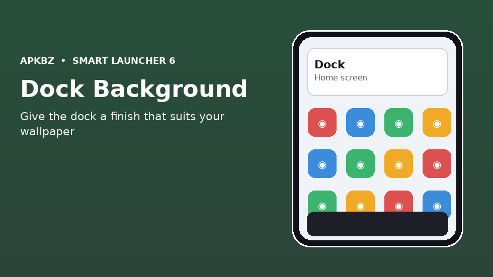
The dock is the strip at the bottom of the home screen that holds your most important apps, visible on every panel. Because it is always there, its appearance shapes the whole home screen more than almost any other single element. A dock with no background lets icons float directly over the wallpaper, which can look elegant on a calm image and chaotic on a busy one. Adding a background — a subtle bar, a frosted panel, or a solid shape — anchors those icons, improves legibility, and gives the home screen a finished frame. This guide explains how to add a dock background in Smart Launcher 6, how to choose a style that suits your wallpaper, and how to avoid the common mistakes that make a dock look heavy or distracting.
Why the dock deserves its own background
Think about how often your eye lands on the dock. Every time you unlock the phone, switch panels, or look for a core app, the dock is in the same place at the bottom of the screen. If its icons blend into the wallpaper, you have to hunt for them, even if only for a fraction of a second. That fraction adds up over hundreds of unlocks a day, and it also creates a subtle feeling of untidiness that is hard to pin down.
A background solves this by creating a consistent surface behind the icons. Regardless of what the wallpaper is doing behind the dock — bright sky, dark foliage, a person’s face — the icons sit on a known, readable surface. The background also visually separates the dock from the rest of the panel, signalling “these apps are always here” as opposed to the panel content above, which changes as you swipe.
There is an aesthetic benefit too. A well-chosen dock background acts like a frame at the bottom of a picture: it completes the composition. Without it, a home screen can feel like it simply stops at the bottom edge. With it, the layout feels intentional from top to bottom.
Finding the dock settings
Start in Smart Launcher 6 settings, in the section covering the home screen, dock, or appearance. The dock controls are usually grouped together: how many icons the dock holds, whether it shows labels, its size, and its background or style. If you cannot find a dedicated dock section, look under home screen layout or panel settings, since some versions nest dock options there.
Before changing the background, note your current dock setup: how many apps it holds, whether labels are shown, and how large the icons are. A background that looks good with four large icons may look cramped with six small ones, and a background that suits a label-free dock may look busy once labels are added. Changing the background in isolation, without considering those neighbours, is the most common reason a new dock style disappoints.
If the launcher offers a live preview in settings, use it as a rough guide only. Always judge the final result on the actual home screen, with your real wallpaper behind it, because a preview on a neutral settings background flatters almost any style.
Choosing a background style
Dock backgrounds generally fall into four styles. A transparent background is the default on many setups: no bar at all, icons floating over wallpaper. It is the most minimal option and the best choice for a calm, uncluttered wallpaper where icons are already perfectly legible. Its weakness is that it offers no help on a busy wallpaper, and it can make the dock feel disconnected from the rest of the layout.
A translucent or frosted background — often called a blur or glass effect — is the most versatile choice. It softens the wallpaper behind the dock without hiding it entirely, so icons stay readable while the wallpaper still shows through. This is an excellent default if you change wallpapers often, because it adapts to each image rather than fighting it. Check performance on older phones, though: blur effects can occasionally make animations slightly less smooth, and if you notice that, a simpler style is worth trying.
A solid background uses a single colour, often drawn from the theme or chosen manually. It gives the strongest separation and the best legibility, and it suits bold, graphic home screens where the dock is meant to be a clear design element. The risk is heaviness: a solid black bar on a light wallpaper, or a bright colour that clashes with the theme, can dominate the screen. If you choose solid, pick a colour that already appears in your theme or wallpaper, and keep it muted rather than saturated.
A shaped background — a pill, a rounded rectangle that does not span the full width, or a floating bar with margins — is a modern variation. A floating pill dock looks contemporary and leaves wallpaper visible at the corners, which keeps the home screen feeling open. It works best with four or five icons; with many icons, the pill either stretches to full width anyway or squeezes the icons uncomfortably.
Step-by-step: adding the background
Once you have chosen a style in principle, apply it and refine it in place. Open the dock settings, find the background, style, or appearance option, and select your preferred style. If there are controls for opacity, corner radius, or margins, adjust them one at a time, returning to the home screen after each change to see the effect in context.
Opacity is the most powerful refinement. A background at full opacity is bold and unmistakable; at low opacity it is a whisper of separation. Most home screens look best somewhere in the middle — enough opacity to lift the icons off the wallpaper, not so much that the bar becomes a slab. Start around a medium value and move in small steps until the icons read instantly without the bar drawing the eye.
Corner radius and margins work together. Sharp, full-width corners suit a formal, grid-like layout. Rounded corners with side margins suit a softer, floating look. Whichever you choose, make it consistent with the rest of your launcher: if your widgets and folders use rounded corners, a sharp dock will look out of place, and vice versa. Visual consistency across elements is what makes a home screen feel designed rather than assembled from unrelated parts.
Finally, check the dock on every panel, not just the first. If you use multiple home screen panels with different widgets or wallpapers, the dock background must work on all of them. A style that is perfect on a plain panel may fail on a panel with a bright widget behind it. If one panel causes trouble, the background opacity or style usually needs adjusting, not the panel itself.
Matching the background to your wallpaper and theme
The dock background should agree with two things: the wallpaper and the theme. With a dark wallpaper, a dark translucent background blends seamlessly and keeps the dock understated. With a light wallpaper, a light translucent background does the same. A background that fights the wallpaper — dark bar on a light image, or vice versa — can still work if it is deliberate, such as a dark dock anchoring a bright, airy home screen, but it should be a conscious choice, not an accident.
If you use a dynamic Material You theme, a theme-aware dock background is usually the best starting point, because it will shift with the wallpaper and stay in harmony. A manually chosen colour, by contrast, will stay fixed while the theme changes around it, and may clash after your next wallpaper change. If you change wallpapers rarely, manual colour gives you precise control. If you change them often, theme-aware is less maintenance.
Also consider the apps in the dock. Icons with colourful, varied designs need a calmer background to sit on. Icons that are already uniform — themed icons in a single shape and palette — can tolerate a bolder background, because the icons themselves are not competing. When in doubt, simplify the background; the dock’s job is to make icons findable, not to be admired itself.
Dock size, icon count, and labels
A background change is a good moment to review the dock as a whole. Five icons is a common sweet spot: enough for phone, messages, browser, camera, and one personal favourite, without crowding. Four feels spacious and minimal; six or seven can work on larger phones but often feel cramped, especially with labels on.
Labels under dock icons add clarity but also visual weight. With a background in place, labels are usually readable, and they help distinguish similar icons. Without labels, the dock looks cleaner but relies entirely on icon recognition. If you share the phone or use many similar-looking apps, labels are worth keeping. If the dock holds only apps you could recognise blindfolded, hiding labels gives a cleaner result.
Icon size interacts with the background too. Larger icons need a taller background bar, which takes more screen space. Smaller icons leave more room for panel content but are harder to tap accurately, especially one-handed. Keep the dock tall enough that icons are comfortably tappable — a dock that looks sleek but causes frequent mis-taps is a failed design, however pretty it photographs.
Common problems and fixes
If the background does not appear after you select it, check whether a conflicting setting is overriding it, such as a full-screen panel mode, a gesture setting that hides the dock, or a theme that forces transparency. Also confirm you are looking at the home screen dock and not a drawer or folder view, where dock settings may not apply.
If the background looks good in settings but wrong on the home screen, the wallpaper is the likely cause. A background that is too transparent on a busy wallpaper will look invisible; increase opacity or switch to a more solid style. Conversely, a background that looks like a heavy slab may simply need lower opacity or rounded, margined corners to feel lighter.
If the dock background changes unexpectedly after a wallpaper change, you are probably using a theme-aware background. That is working as intended, but if you prefer stability, switch to a fixed colour or a neutral translucent style that does not follow the theme. And if animations feel slower after adding a blur background, try a non-blur translucent or solid style; the visual difference is small, and the smoothness gain on older hardware can be noticeable.
Conclusion
Adding a background to the Smart Launcher 6 dock is a small change that improves the home screen every time you use the phone. Choose a style that suits your wallpaper — translucent for versatility, solid for bold separation, floating pill for a modern look, or transparent for a truly minimal setup — then refine opacity, corners, and margins until the icons read instantly without the bar stealing attention. Match it to your theme, keep the icon count sensible, and judge the result on the real home screen. A dock that is easy to find and easy to tap is doing its job, quietly, hundreds of times a day.
Frequently Asked Questions
How do I add a background to the dock in Smart Launcher 6?
Open the launcher settings, find the dock or home screen section, and choose a background style, then adjust opacity, corner radius, and margins to suit your wallpaper.
What dock background style is best?
A translucent or frosted background is the most versatile, because it keeps icons readable while letting the wallpaper show through. Solid backgrounds suit bold layouts; transparent suits minimal ones.
Why doesn’t my dock background show up?
Check for a conflicting setting such as full-screen mode or a theme forcing transparency, and confirm you are viewing the home screen dock rather than the drawer.
Will a blur dock background slow down my phone?
On most modern phones, no. On older hardware, blur can occasionally affect animation smoothness; switching to a non-blur translucent style usually restores it.
Should the dock background follow my theme or stay fixed?
Theme-aware backgrounds stay harmonious when you change wallpapers often. A fixed colour gives precise control if you rarely change wallpapers.