
Why One Widget Can Beat Ten
A home screen crowded with widgets promises everything at a glance and often delivers nothing clearly. Each widget competes for attention, each updates on its own schedule, and the eye has nowhere to rest. A one-widget home screen makes the opposite bet: that a single, well-chosen piece of information, presented beautifully, is more useful than a dashboard of half-read cards. It is a bet that usually pays off, because it forces a decision about what actually matters.
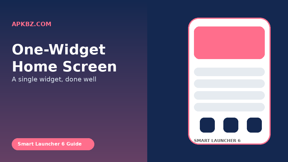
In Smart Launcher 6, a one-widget layout works especially well. The launcher’s flower already handles app launching elegantly, so the widget does not need to do that job. It can focus entirely on information: what is next, what the weather will do, what you need to remember, or what you are listening to. Freed from competing widgets, that single card can be larger, more readable, and more considered than it could ever be in a crowded layout.
This guide shows how to choose that one widget, how to build the layout around it in Smart Launcher 6, and how to live with the restraint without feeling as though you have given something up. The goal is not emptiness for its own sake. It is a home screen that answers one question brilliantly and gets out of the way for everything else.
Choosing the One Widget: The Question Test
The hardest part of a one-widget home screen is not building it; it is choosing the widget. A useful test is to ask: if my phone could answer only one question when I unlock it, what would that question be? For many people the answer is “what is next?” — answered by a calendar agenda widget. For others it is “what is the weather doing?” — answered by a weather widget. For others still it is “what do I need to do today?” — answered by a task list.
Write down your answer before you browse widgets. Browsing first leads to choosing the prettiest widget rather than the most useful one, and prettiness fades while usefulness compounds. If you cannot pick a single question, look at your last week of phone use. Which information did you actually check repeatedly, rather than merely enjoy seeing? That repeated check is your widget. The widget you admired once but never checked again is decoration, and decoration does not earn the only slot.
Also consider time of day. A calendar widget is most valuable during work hours, while a weather widget may be most valuable in the morning. If your question changes by time of day, a widget that adapts — such as an agenda that shows today’s events in the morning and tomorrow’s in the evening — may serve you better than a static card. The best one widget is often the one that changes its answer as the day progresses.
Step by Step: Clearing the Home Screen
Start by removing every widget from your Smart Launcher 6 home screen except the one you have chosen. Long-press each unwanted widget and remove it, or enter edit mode and clear the widget area entirely before adding your chosen widget back. Clearing first, rather than adding to a crowded screen, prevents the common mistake of keeping a second widget “just in case” and ending up with a two-widget screen that slowly grows back to five.
Next, simplify the flower. A one-widget screen does not require a minimal flower, but a tidy flower complements it. Keep the apps you open daily in the flower and move the rest to the drawer, where Smart Launcher’s categories will keep them findable. The flower should feel like a small, confident set of tools, not a second dashboard. Six to eight apps is a good range for most people; fewer feels restrictive, more starts to feel crowded again.
Choose a wallpaper that supports the widget rather than competing with it. A busy photograph will fight a detailed widget for attention, while a soft gradient, a muted landscape, or a solid colour with subtle texture will let the widget stand out. Smart Launcher’s theming options can help here: a widget with a translucent or solid background often reads better against a calm wallpaper than a fully transparent widget that lets a busy image show through its text.
Step by Step: Placing and Sizing the Widget
Place your chosen widget in the most prominent available space, usually near the top of the home screen or centred above the flower, depending on your layout. The exact position matters less than prominence: the widget should be the first thing your eye lands on when you unlock the phone. If you have to hunt for it, it is not in the right place, however logical the placement seemed in edit mode.
Size the widget generously. One advantage of having only one widget is that it can be large without crowding anything else. A calendar widget that shows four or five events is far more useful than one that shows a single event and forces you to open the app for the rest. A weather widget that shows today’s hourly forecast is more useful than one that shows only the current temperature. Use the space you have saved by removing other widgets to make this widget genuinely informative.
Check readability in real conditions, not just indoors. Step outside into bright light and glance at the widget. Can you read it without squinting or shading the screen? If not, adjust the widget’s theme, increase its contrast, or choose a version with larger text. A one-widget home screen lives or dies on glanceability, and glanceability in sunlight is the hardest test. A widget that fails that test will push you back to opening apps, defeating the purpose of the layout.
Living With Restraint: What to Do About Everything Else
The obvious worry with a one-widget screen is that you will miss information you used to see. The answer is to move that information to places where you seek it deliberately, rather than places where it seeks you. News, for example, does not need to be on your home screen; it can live in a news app you open when you choose to catch up, or in Smart Launcher’s feed if your build offers one. The home screen stops being a news ticker and becomes a calm starting point.
Tasks and reminders deserve special thought, because they are the category most people fear losing. If your one widget is not a task widget, use a different mechanism for tasks: a persistent notification, a lock-screen reminder, or a task app you open at set times during the day. The point is not to ignore tasks, but to stop letting them shout from the home screen all day. A task that is due at 5 p.m. does not need to be visible at 9 a.m., and a one-widget screen helps you notice that distinction.
Give the layout a full week before judging it. The first two days will feel strange, because your eye will keep looking for widgets that are no longer there. That strangeness is not evidence that the layout is failing; it is evidence that your old habits are loosening. By day five or six, you will know whether you are actually missing information or merely missing the habit of seeing it. Most people discover it is the latter, and that discovery is the real benefit of the experiment.
Variations Worth Trying
A one-widget screen does not have to mean the same widget forever. Some people rotate their single widget seasonally: a calendar widget during a busy work period, a weather widget during a holiday, a fitness widget during a training block. That rotation keeps the home screen fresh without breaking the one-widget discipline, because there is still only one widget at any time. The discipline is about count, not about permanence.
Another variation is a one-widget screen with a stack as the widget. A stack technically contains several widgets, but it occupies a single footprint and shows only one card at a time. Purists may object, but pragmatically a stack can be a good compromise if you genuinely need two kinds of information — for example, calendar and weather — and cannot choose between them. Set the stack to show your primary card by default and swipe only when you deliberately want the second. That preserves most of the calm while solving a real dilemma.
A third variation is to pair the one widget with a single, well-chosen shortcut or gesture. For example, a calendar widget plus a swipe gesture that opens your task app gives you two kinds of productivity without a second widget. Smart Launcher’s gesture options make this easy, and it keeps the visual layout clean while preserving quick access. The home screen looks like one widget, but it behaves like a little more, and that hidden depth is part of its appeal.
Conclusion
A one-widget home screen in Smart Launcher 6 is built by choosing a single question your phone should answer, clearing everything else, placing and sizing that widget generously, and moving other information to places you visit deliberately. It feels strange for a few days, then it feels calm, because your eye finally has one place to land. Try it for a week with your real daily question, and you may find that one widget, done well, tells you more than ten widgets ever did.
FAQ
What is the best widget for a one-widget home screen?
There is no universal best widget. Choose the widget that answers the question you ask most often when you unlock your phone — often a calendar agenda, a weather forecast, or a task list — rather than the widget that looks prettiest in a screenshot.
Will I miss important information with only one widget?
You may miss the habit of seeing it, but rarely the information itself. Move secondary information to apps you open deliberately, and use notifications or lock-screen reminders for time-sensitive tasks that your chosen widget does not cover.
Can a widget stack count as one widget?
Pragmatically, yes, because a stack occupies one footprint and shows one card at a time. Set your primary card as the default and swipe only when you deliberately want the second card, to preserve most of the calm of a true one-widget layout.
How large should the single widget be?
As large as it needs to be to answer its question without opening an app. A calendar widget showing several events, or a weather widget showing an hourly forecast, is more useful than a small card that only teases the information.
How long should I try a one-widget layout before deciding?
Give it a full week. The first two days feel strange because old habits are loosening, not because the layout is failing. By day five or six you will know whether you are missing real information or merely missing the habit of seeing it.


