Retro icon packs promise a time machine and deliver, too often, a fancy-dress box: a sepia filter over modern logos, a few pixel fonts, and call it vintage. The packs worth keeping understand that “retro” is not one era but several distinct design languages — early skeuomorphic realism, pixel art, seventies print warmth, eighties chrome — each with its own rules. This guide separates those families, explains what makes each convincing or kitsch, and gives you the checks to run in Smart Launcher 6 before a nostalgia purchase becomes drawer clutter. No ratings, no download counts: just styles, trade-offs, and what to verify.
Four retro families worth knowing
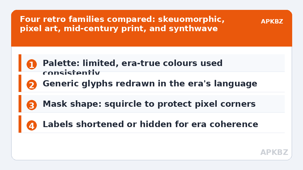
Skeuomorphic throwbacks imitate the first smartphone era, when icons were tiny photographs of real objects: a stitched leather notebook, a brass camera, a paper plane you could almost fold. Drawn well, they are warm and instantly readable; drawn lazily, they are muddy at modern sizes because the original style predates high-density screens. Pixel-art packs render every glyph on a coarse grid with a limited palette. They are the most internally consistent family — the grid disciplines every icon equally — and the least forgiving of uncovered apps, whose smooth modern icons look like visitors from another planet beside them.
Mid-century and seventies print packs use flat shapes, limited inks, and slightly off-register charm: mustard, avocado, burnt orange, cream. They are the easiest retro family to live with daily, because flat design ages gracefully at small sizes. Eighties and synthwave packs deal in chrome gradients, grids, and sunset stripes; they overlap with neon territory but aim at nostalgia rather than night-club glow, and they demand a committed wallpaper to make sense. When you shop, name the family you want first. “Retro” as a search term mixes all four, plus a fifth category of packs that simply look old because they were abandoned years ago — which is a different thing entirely.
Treat these numbers as a starting point: apply them in Smart Launcher 6 under Settings → Home screen → Grid, use the layout for a day, then nudge one value at a time — your wallpaper, widget sizes and one-handed reach all shift what feels right.
Convincing retro vs costume retro
| Element | Convincing | Costume |
|---|---|---|
| Palette | Limited, era-true colours used consistently | Sepia wash over unchanged modern colours |
| Generic glyphs | Mail, camera, settings redrawn in the era’s language | Only famous app logos restyled; generics forgotten |
| Texture | Subtle, survives shrinking to drawer size | Heavy grain that turns to dirt at small sizes |
| Typography in icons | Era-appropriate letterforms for letter-based icons | Modern logos with a “vintage” badge stuck on |
The generic-glyph row is the tell. Every setup lives on its mail, messages, camera, settings, and folder icons, and a serious pack redraws those with the most care, not the least. A pack that lavishes attention on twenty famous social logos while its settings gear looks like clip art will feel wrong within a day. This is the same audit we recommend for any pack in our guide to applying adaptive packs: judge the pack by its generics and its coverage of your library. For the pixel family especially, also note that several beloved pixel sets live on F-Droid with public request trackers, where their maintainers publish coverage lists you can check against your own library before installing.
Setting up a retro look that survives daily use
Retro packs need a supporting cast. The wallpaper should come from the same era as the icons — a flat mid-century pattern for print packs, a dark gradient horizon for synthwave, a plain textured backdrop for skeuomorphic sets — or the icons will look like stickers on the wrong fridge. Your mask shape matters too: pixel packs often look best in a squircle or rounded square that respects the grid, while a tight circle mask can bite the corners off pixel compositions. The shape controls are covered in our guide to custom icon shapes in Smart Launcher; spend five minutes there before blaming a pack for cropped corners.
Labels deserve a decision as well. Era-true setups often hide labels or use short renamed labels, because nothing breaks a 1978 illusion like a truncated modern app name with an ellipsis. Smart Launcher’s label editing makes this painless, and a retro home screen with six well-chosen, label-free icons reads as a designed object rather than a drawer. Keep labels in the drawer itself if recognition suffers; nostalgia should never cost you the ability to find your banking app. Readers collecting the full set of retro-adjacent guides can start from our home page, which links the whole icon customisation series.
Coverage, updates, and the abandonment problem
Retro is the family most exposed to abandonment, because era-styled packs are often passion projects: one artist, one burst of energy, then life intervenes. An unmaintained retro pack freezes your library in the year it stopped, and every new app arrives in flat modern dress. Check the last update date before installing, and weigh a slightly less perfect pack with an active author over a masterpiece last touched three years ago. Where coverage gaps appear, the standard remedies apply: a generic in-style glyph assigned by hand, or a request to the author. Our sibling guide to 3D and textured packs faces the same maintenance reality from the opposite stylistic direction, and its audit checklist transfers well.
Finally, a word in defence of mixing eras deliberately. A mid-century home screen with a modern, legible drawer is not a failed retro setup; it is a themed front door on a practical house. Smart Launcher applies one pack globally, but per-icon overrides let you soften the commitment exactly where usability demands it. The goal is a phone that makes you smile when you unlock it and never makes you hunt for an app. Any pack, from any decade, that does both has earned its place.
Matching a retro pack to your actual habits
The right retro family depends on how you use the drawer. Fast scanners, who find apps by colour flash and position, should lean toward mid-century print packs, whose flat colour blocks preserve that rapid recognition. Deliberate users with small, curated home screens can afford pixel or skeuomorphic sets, because their icons are destinations rather than an index. Photographers and designers often enjoy the era discipline itself and will tolerate slower recognition as the price of a coherent object; everyone else should be honest that they will not, however beautiful the screenshots. There is no hierarchy here, only fit: the pack you keep is the one whose costs your habits can pay daily.
One more fit test is generational in the literal sense. If family members regularly use your phone — to call, to photograph, to navigate — a strongly themed retro set taxes them hardest, because every learned icon becomes a small puzzle. Keeping labels on, choosing the most literal glyphs the pack offers for phone, camera, and messages, and leaving a couple of stock icons untouched in the dock are not compromises of the aesthetic. They are the difference between a themed phone and a themed phone that still works as a household tool. Retro design, at its historical best, was always functional first; your setup should honour that order.
Frequently Asked Questions
Which retro style is easiest to use every day?
Mid-century and seventies print styles, because their flat shapes and limited palettes stay legible at drawer size and tolerate uncovered apps better than other families. Pixel packs are the most consistent but the least forgiving, and skeuomorphic packs vary the most in quality, so audition those at real icon size before committing.
Why do some retro packs look dirty or blurry on my phone?
Usually because their texture or detail was designed for older, lower-density screens and is being upscaled, or because heavy grain that looks charming in a large preview collapses into noise at icon size. Prefer packs with recent updates and adaptive or high-density assets, and judge previews at the smallest size available.
Can I make my own retro pack instead of buying one?
Yes — Icon Pack Studio can apply a limited palette and texture treatment to your existing icons, which produces a coherent retro-flavoured set with full coverage of your apps. It will not replicate hand-drawn skeuomorphic art, but for print and pixel-flavoured looks a disciplined generated treatment is surprisingly convincing.
Do retro packs work with Smart Launcher’s icon shapes?
Yes, Smart Launcher masks them like any other pack. The caveat is artistic: pixel and skeuomorphic compositions drawn close to the tile edge can lose corners under a circle mask. A squircle or rounded square usually preserves the artwork best, and per-icon replacement handles the few glyphs that still fight the shape.