A home screen where every icon shares one shape has a calm that mixed screens never achieve — and achieving it is not really about taste. It is about understanding that Android’s adaptive icon system was designed for exactly this trick: separate the artwork from the outline, and let the launcher impose the outline. Smart Launcher 6 builds its icon appearance around that separation. This guide explains how adaptive masking works, why some icons still escape the shape, and the settings and habits that get you as close to a truly uniform grid as the platform allows.
How adaptive masking creates one shape
An adaptive icon is two layers — a background and a foreground glyph — drawn on a canvas larger than the visible area. The launcher applies a mask, an outline such as a circle, squircle, teardrop, or rounded square, and clips both layers to it. The artist designs for the safe zone in the middle, knowing the edges will be cut differently by different masks. That is why the same app can look correct as a circle on one phone and a squircle on another: the artwork never changed, only the window you see it through. When you change the shape in Smart Launcher, you are not stretching pictures; you are re-clipping layered artwork, and genuinely adaptive icons survive the change without distortion. Our foundational guide to applying adaptive icon packs explains the layer model from the pack side, and it is worth reading alongside this one.
Legacy icons complicate the picture. An old app or an old pack may supply a single flat picture with its shape already baked in — a rounded square from 2016, say, with white corners. A mask cannot un-bake that shape; the launcher can only scale the picture to fit inside the new mask, place it on a generated background, or clip it and lose corners. Smart Launcher generally chooses the fit-and-backplate approach, which is why legacy stragglers appear as smaller pictures sitting on tiles of your chosen shape. The shape is still consistent at the tile level; the artwork inside is what varies. Knowing which of your icons are legacy explains ninety percent of “why does this one look different” questions.
Treat these numbers as a starting point: apply them in Smart Launcher 6 under Settings → Home screen → Grid, use the layout for a day, then nudge one value at a time — your wallpaper, widget sizes and one-handed reach all shift what feels right.
The settings that control uniformity
| Setting | Effect on consistency | Recommended approach |
|---|---|---|
| Mask shape | Defines the one outline every adaptive icon takes | Pick once; live with it a week before switching |
| Generated background colour | The tile colour behind legacy and uncovered icons | Match it to your pack’s dominant tile colour |
| Icon size | Larger sizes expose more background layer | Moderate size hides layer differences best |
| Per-icon overrides | Individual exceptions to the global rule | Use for shape-fighters, not for variety |
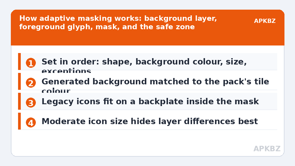
Set them in that order: shape, background, size, exceptions. Shape first because it is the decision everything else serves. Background second because it determines whether your least-modern icons blend or advertise themselves. Size third because it fine-tunes how much of each layer shows. The dedicated guide to changing icon size, shape and shadow treats each control in depth, including why the circle mask shows the least artwork and the rounded square the most. Exotic shapes such as the teardrop reward experimentation once this uniform baseline works, because by then you can judge a new outline by how the whole grid behaves rather than by a single favourite icon.
The escapers: icons that resist the mask
Even with perfect settings, a few categories resist. Icons with baked-in shapes, discussed above, sit inside the mask rather than filling it. Icons drawn outside the safe zone lose their edges to aggressive masks — a glyph designed to the corners will be beheaded by a circle, a problem dissected in our sibling troubleshooting of packs that miss apps, when a pack does not apply to new apps, where fallback behaviour is the theme. Brand logos with legal padding arrive small and centred by their owner’s guidelines, and no mask can enlarge them without cropping someone else’s artwork. And a handful of system utilities on some manufacturer skins present non-adaptive icons that the launcher must backplate. For each escaper the remedy is the same: accept the backplate in a matched colour, or override that one icon with an adaptive-friendly alternative from a pack.
Judge uniformity at arm’s length, not at screenshot zoom. The human eye reads the grid’s rhythm — tile colour, shape, spacing — long before it reads individual glyphs. If the tiles march in step, the screen looks unified even when a few glyphs are smaller than their neighbours. Perfectionism applied icon by icon produces the opposite of calm: endless editing. Set the system up correctly, fix the two or three worst escapers, and let the rest be texture. More setup philosophy, and the index of this whole series, lives on our home page.
Uniform shape as a system, not a setting
The deepest reason to pursue one shape is not tidiness but change management. With masking doing the unifying, you can swap icon packs, wallpapers, and even phones while your grid’s skeleton — shape, size, rhythm — stays recognisably yours. The pack becomes a wardrobe change rather than a renovation. Users building a full personal set in Icon Pack Studio, as our sibling guide to creating your own icon pack describes, benefit most of all: generate the artwork once, and let Smart Launcher’s mask impose whatever shape your taste settles on this year, re-clipping the same layers when taste changes next year. That separation of artwork from outline is the adaptive system’s real gift, and a uniform grid is simply what it looks like when you accept the gift fully.
Testing a shape before you commit the grid
Shape changes are cheap to try and surprisingly sticky once lived with, so test deliberately. Apply a candidate shape and screenshot your two most-used screens; then live with the shape for at least two full days of normal use before judging, because the first hour measures novelty, not fit. Look for three things during the trial: whether your most-tapped apps remain instantly findable, whether wide or corner-heavy glyphs are being clipped anywhere, and whether the grid’s rhythm — the pattern your eye reads before it reads icons — feels calmer or busier than before. A shape that passes all three at arm’s length is your shape, whatever the internet’s current favourite happens to be.
Households and shared devices add one more criterion: other people’s recognition. The primary user’s eye adapts to anything within a week, but a partner borrowing the phone to make a call reads the grid cold. Shapes that preserve the most artwork — rounded square and squircle — are the most legible to cold readers, while aggressive shapes trade a little of that legibility for style. Weigh whose eyes the phone serves. Uniformity is a means to a screen that feels inevitable, not an end in itself, and a shape everyone in the house can read at a glance is more inevitable than a fashionable one only its owner understands.
Frequently Asked Questions
Why do a few icons not fill the shape like the others?
Those icons are legacy or flat artwork with their shape already baked in, so the launcher cannot re-clip them; it scales them to fit inside your mask on a generated background instead. Matching that background colour to your pack’s tiles makes them blend, and overriding the worst offenders with adaptive alternatives finishes the job.
Which mask shape shows the most icon artwork?
The rounded square, because its area is closest to the full tile. The circle shows the least, inscribing a smaller visible window and clipping corners of anything drawn wide. Squircles sit between the two in both area and character, which is why they are the most popular compromise for mixed libraries.
Does changing shape damage icon quality?
No, for genuinely adaptive icons. The launcher re-clips the original foreground and background layers at the new outline, rendering fresh bitmaps rather than stretching old ones. Quality only suffers for flat legacy art that gets scaled, and even there the change is a fit decision, not a distortion.
Can different apps have different shapes in Smart Launcher?
The mask is intentionally global — one shape is what creates the unified look. Per-app variety comes from the artwork inside the shared outline, not from different outlines. If one icon fights the shape badly, replace that icon individually rather than bending the rule that makes the whole grid cohere.