Flat design won the last decade so completely that a bevelled, shadowed, almost touchable icon now stops the thumb mid-scroll. Three-dimensional and textured packs are the counter-reformation: icons with depth, materials, and light. They are also the easiest family to buy badly, because depth is expensive to draw, quick to look dated, and brutal at small sizes when done carelessly. This guide maps the main 3D and textured styles you will encounter for Smart Launcher 6, explains what separates crafted depth from clip-art bulk, and gives you an audit you can run in minutes before any pack joins your home screen.
The main families of depth
Soft 3D illustration packs render each glyph as a small matte object — a clay-like camera, a rounded mail envelope with real thickness — lit from a consistent direction. They feel modern rather than nostalgic, and their restraint keeps them legible. Glossy skeuomorphic packs revive the glassy, reflective style of early smartphones, all highlights and chrome; they pair with the retro impulse we explored in retro and vintage packs, and they date fastest, because gloss is a fashion with a short half-life. Textured material packs keep flat glyph shapes but skin them in materials — brushed metal, leather grain, paper fibre, wood. They are the easiest depth family to live with, since the silhouettes stay familiar while the surfaces gain character.
A fourth, smaller family deserves respect: isometric and diorama packs, where each icon is a tiny scene viewed at an angle — a desk, a shopfront, a control panel. They are the most artistic and the least scannable; a drawer of dioramas is a gallery you browse, not an index you search. Choose them for a curated home screen, not for a 200-app library. Across all four families, one question predicts satisfaction: does the depth serve recognition, or compete with it? The packs worth keeping always answer the same way.
Treat these numbers as a starting point: apply them in Smart Launcher 6 under Settings → Home screen → Grid, use the layout for a day, then nudge one value at a time — your wallpaper, widget sizes and one-handed reach all shift what feels right.
The crafted-depth audit
| Test | Crafted depth | Cheap depth |
|---|---|---|
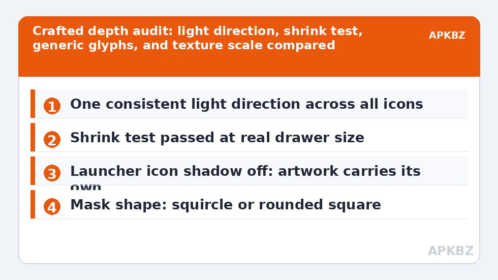
| Light direction | One consistent light source across all icons | Shadows fall in different directions per icon |
| Shrink test | Glyph still readable at drawer size | Detail collapses into shiny mush |
| Generic glyphs | Settings, mail, camera drawn with the most care | Only famous logos modelled; generics are clip art |
| Texture scale | Grain sized for icons, subtle at small size | Texture overwhelms the glyph it skins |
Run the shrink test ruthlessly. Previews show icons at poster size, where every bevel looks intentional; your drawer shows them at a fraction of that, where a busy 3D glyph becomes an unidentifiable jewel. If a pack’s own preview lets you view icons small, do so; if not, install, apply, and judge in the drawer within the refund window of your patience. The generic-glyph row matters for the reason given in our guide to applying adaptive packs: the icons you touch hourly are the generics, and a pack is its generics. Texture interacts with masking too — materials drawn to the tile edge can be clipped oddly by tight shapes — so read our shape discussion in custom icon shapes before blaming a texture pack for cropped corners.
Pairing depth with wallpaper, shape, and labels
Three-dimensional icons cast visual weight, so the rest of the screen should lighten its load. Wallpapers should be calmer and darker or lighter than the icons by a clear margin — a mid-tone busy photograph behind mid-tone glossy icons is the classic failure. Shape choice matters more than with flat packs: roomy masks like the squircle and rounded square preserve modelled compositions, while a circle can amputate a carefully built scene. Labels in a plain, neutral style ground the set; decorative fonts plus 3D icons plus a dramatic wallpaper is three soloists and no band. Smart Launcher’s own subtle icon shadow setting, designed for flat glyphs, should generally be off with 3D packs — the artwork already carries its own shadows, and doubling them muddies the light direction you audited so carefully.
Performance worries are mostly unfounded: whatever their appearance, these icons are still rendered and cached as bitmaps, so a 3D pack scrolls like any other once applied. The real cost of depth is maintenance. Modelled icons are slow to draw, so 3D packs tend to cover fewer apps and update less often than flat ones. Budget for fallbacks — uncovered apps in flat stock style will look flatter than ever beside modelled neighbours — and use overrides generously for your top twenty apps. The series index on our home page points to the per-icon editing guides that make that budgeting painless.
Who should, and should not, live in three dimensions
Choose depth if your home screen is small and curated, if you enjoy objects over diagrams, and if your app library is stable enough that coverage gaps are few. Choose flat if you run a large, changing library, if you read your drawer by fast visual scanning, or if you change packs often — depth packs are commitments, because their look colonises wallpaper, shape, and label choices around them. A hybrid worth knowing: flat pack globally, with a handful of 3D icons overridden onto the home screen’s hero row, gives you depth where it delights and legibility where it counts — the same selective logic our neon roundup applied to glow packs in neon packs for dark setups. Depth, used deliberately, is seasoning. The packs in this family fail only when they insist on being the whole meal.
Depth on a budget: partial and hybrid strategies
Full 3D sets ask a lot of their authors, which is reflected in slower updates, so consider strategies that reduce your dependence on any single pack’s pace. One is the hero-row approach already mentioned: a flat base pack with current coverage, plus 3D overrides for the six to ten icons on your main screen. Another is choosing textured over modelled packs — the material family keeps flat silhouettes, so when an app is uncovered, its stock icon differs in surface rather than in kind, and the visual penalty is smaller. A third is seasonal use: depth packs delight as a deliberate winter or holiday theme, rotated in with full commitment and rotated out before coverage gaps accumulate into annoyance. Rotation reframes maintenance as ceremony.
Whichever strategy you choose, photograph your setup when it pleases you — screenshot, pack name, shape, wallpaper — and keep that record. Depth setups involve more interlocking choices than flat ones, and a note turns “how did I get that look last spring?” from an archaeology project into a two-minute restoration. The broader habit of documenting a working setup, backup included, recurs throughout this series because themed phones are personal software: small, configured, and worth version-controlling in whatever lightweight way you will actually maintain.
Keep expectations about themed system surfaces equally grounded. Like every pack family, 3D sets govern only what Smart Launcher draws — home screen, drawer, categories, and search. Recents, notifications, and system settings will keep showing flat stock icons, and beside a modelled home screen that contrast can feel sharper than usual. It is a platform boundary, not a flaw in the pack, and most users stop registering it within days, in the same way they accept that a themed room still has an unthemed corridor outside its door.
Frequently Asked Questions
Do 3D icon packs slow down the home screen?
No, not after the first apply. However dimensional the artwork looks, the launcher renders and caches each icon as an ordinary bitmap, and scrolling uses those cached images. Any pause you feel happens once, while the cache builds, and is the same pause a flat pack produces on first application.
Why do 3D packs cover fewer apps than flat packs?
Because each icon is a small illustration with modelling, lighting, and texture work, rather than a glyph that can be drawn quickly or adapted from a logo. Authors therefore cover popular apps first and expand slowly. Check coverage of your own most-used apps, and expect to override a few uncovered favourites manually.
Which icon shape suits textured packs best?
Roomier shapes — squircle and rounded square — because they preserve compositions and textures drawn toward the tile edges. Circle masks clip the most artwork and can cut through modelled details. Whatever shape you choose, test the pack’s generic icons at drawer size before judging the whole set.
Can I mix 3D icons with a flat pack?
Yes, through per-icon overrides: keep the flat pack as the global base and assign 3D icons to a small set of home-screen favourites. The contrast works when it looks deliberate — a consistent row or dock — and fails when 3D icons are scattered randomly through the drawer, where they read as errors rather than emphasis.